::: PROJECT :::
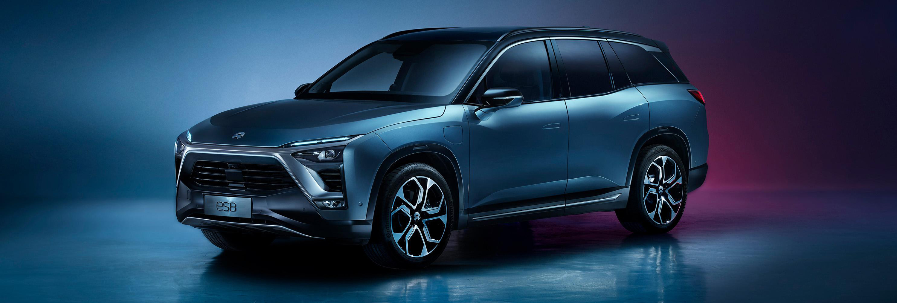
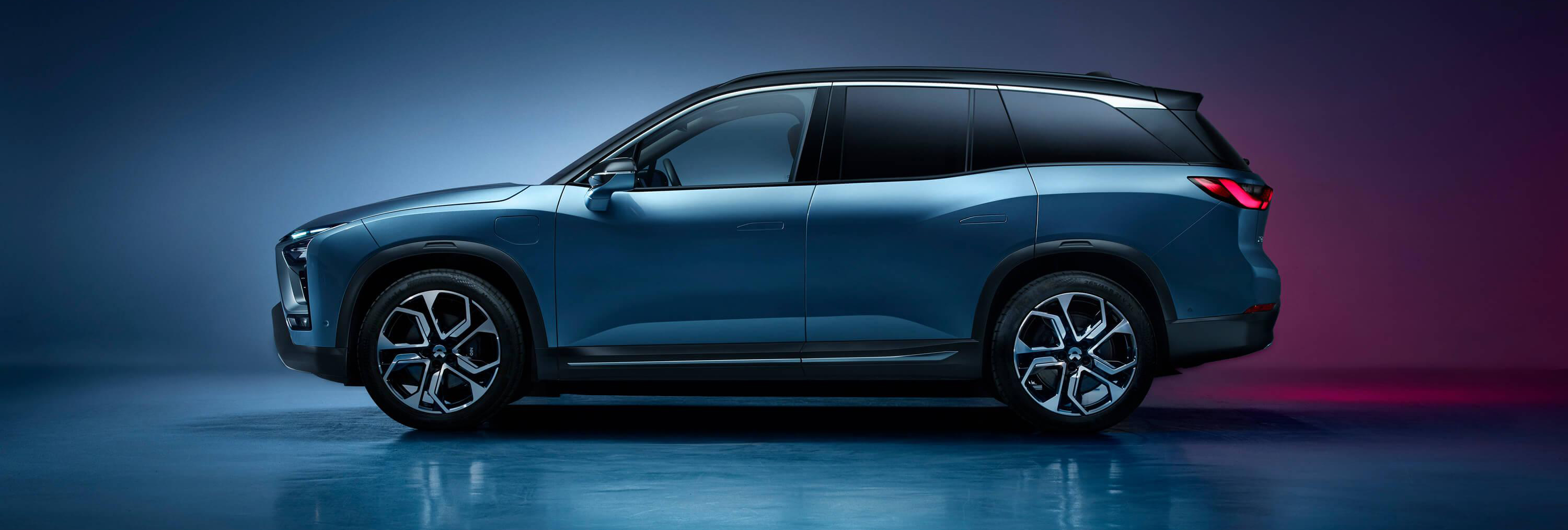
NIO Automotive -ES8
::: CATEGORY :::
-
HMI Design|
-
UI Design|
-
UX Design|
-
Design Management
::: YEAR :::
2016 - 2019
::: SYNOPSIS :::
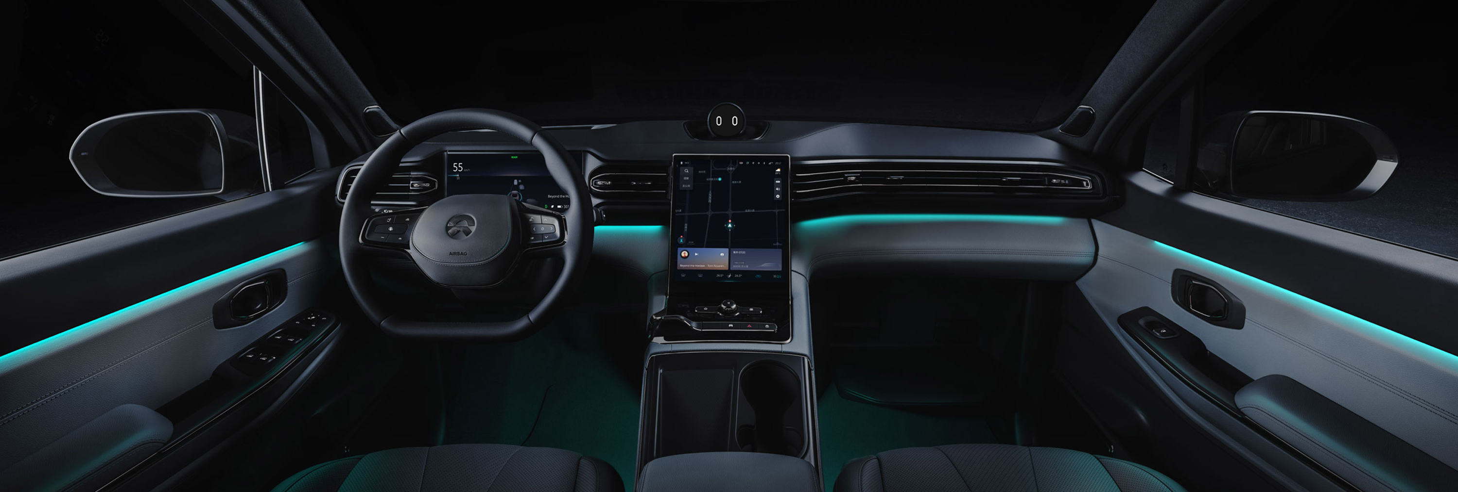
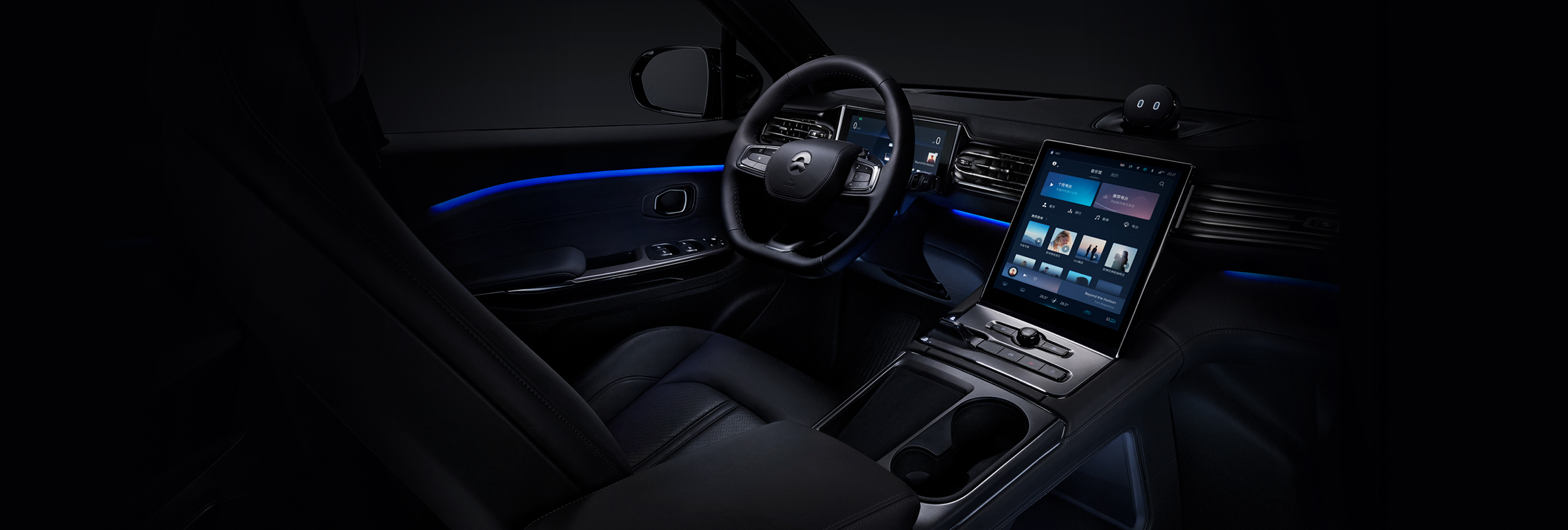
As a young EV startup with a lot of passion for the next cutting edge technology trends, NIO had a vision of creating a infotainment
system that would beat any current system on the market. The race was on to create an impeccable console screen experience which would
become the next trend setter in the market of modern EV cars.
With a role of UI/UX supervisor the challenge was a long journey of technical limitations vs design obstacles that had to be tackled strategically.
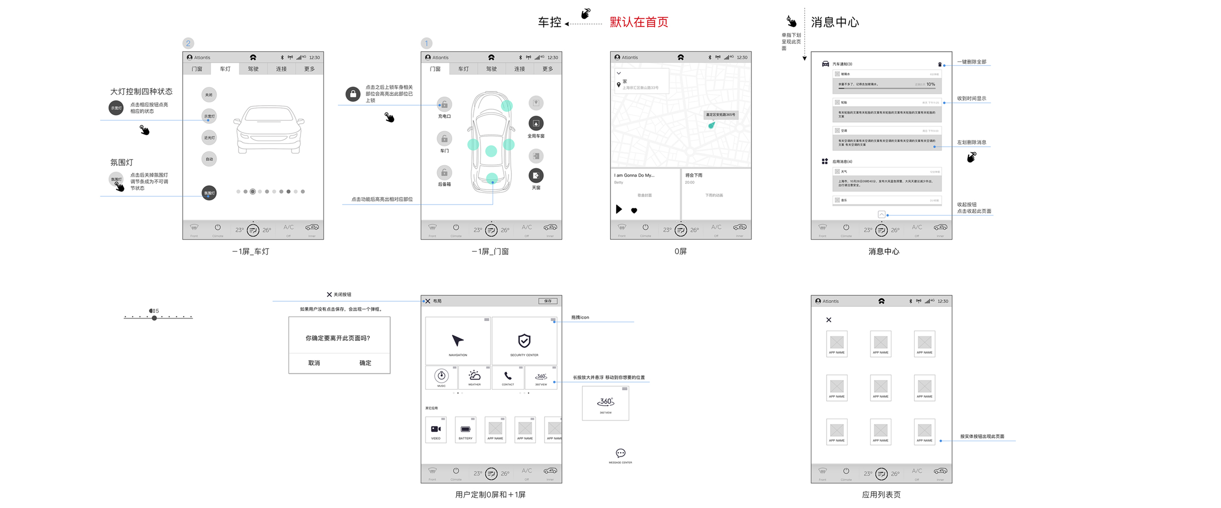
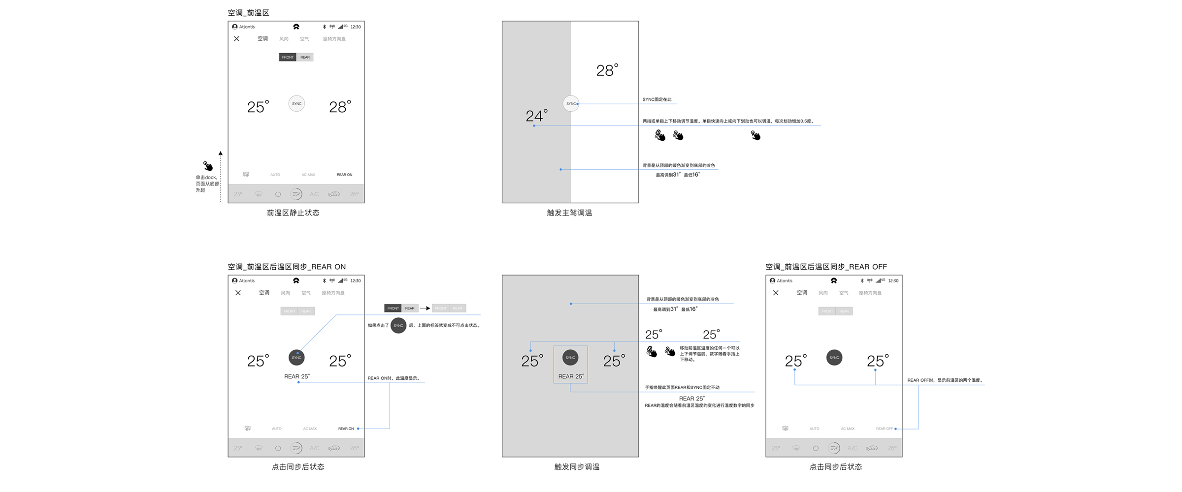
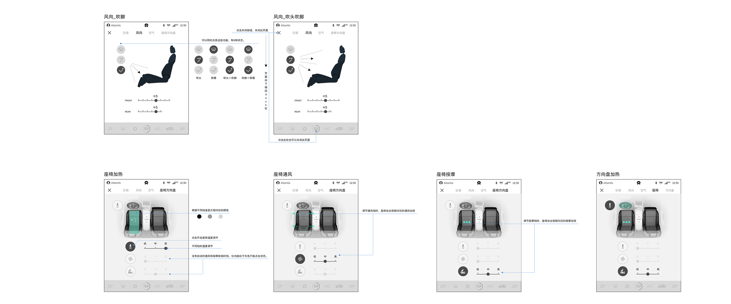
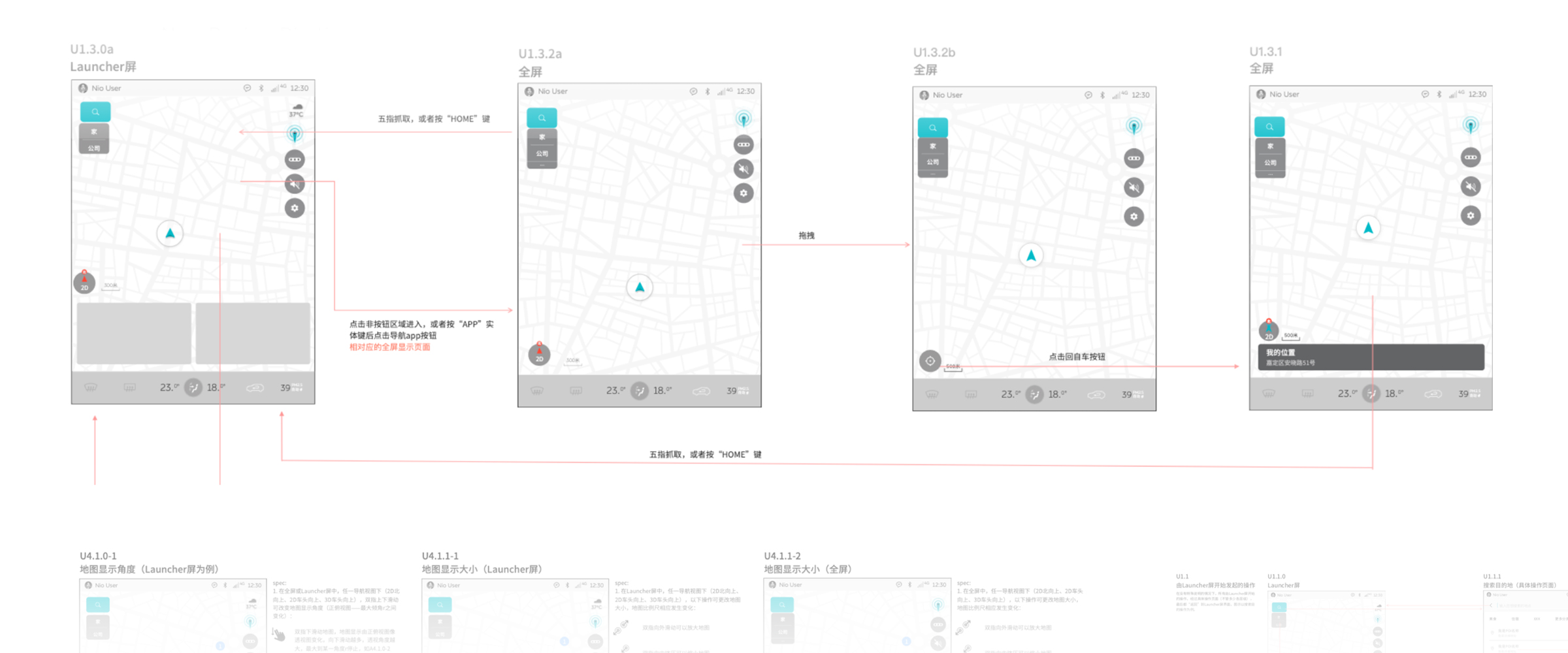
My daily routine successfully dealt with anything from UX flowcharts, high fidelity wireframes, user interactions, UI visual design to interactive prototypes,
brand guidelines, time management and mentoring. The result was following:

Find about more about the award here
01 :::
The Empathy
As the car industry slowly struggles to exit the "status quo" of infotainment experiences, NIO had a vision about a infotainment system that would speed up the pace towards the level 5 authonomy and skip all the competitors around. ES8 as a EV family car of tomorrow had a need of a infotainment system that connects all the family members and leaves a high quality lifestyle feeling in the process.
02 :::
The definition
In every early phase of a product there is always multiple versions and directions that a system could take. Our main goal was to establish what the car itself could do and what is realistic to create for the current production cost and client requirement. Trying to avoid the n-possibilities design trap was the main focus. A solid bridge between the console screen and information cluster had to be paved with smart interactions and A.I
03 :::
The Ideation
In the process of laying ideas the challenge was to sucessfully filter out what is meaningful to the design and user experience and what should be left out from a car experience. Everybody's opinions matter and for me to choose what makes sense and what doesn't was heavily connected with the development capabilities and engineering features inside the car. The ideas of console screen app information connecting with the information cluster such as media, navigation, HVAC, ADAS had to be carefully assesed in every aspect of the user experience.
04 :::
Prototype
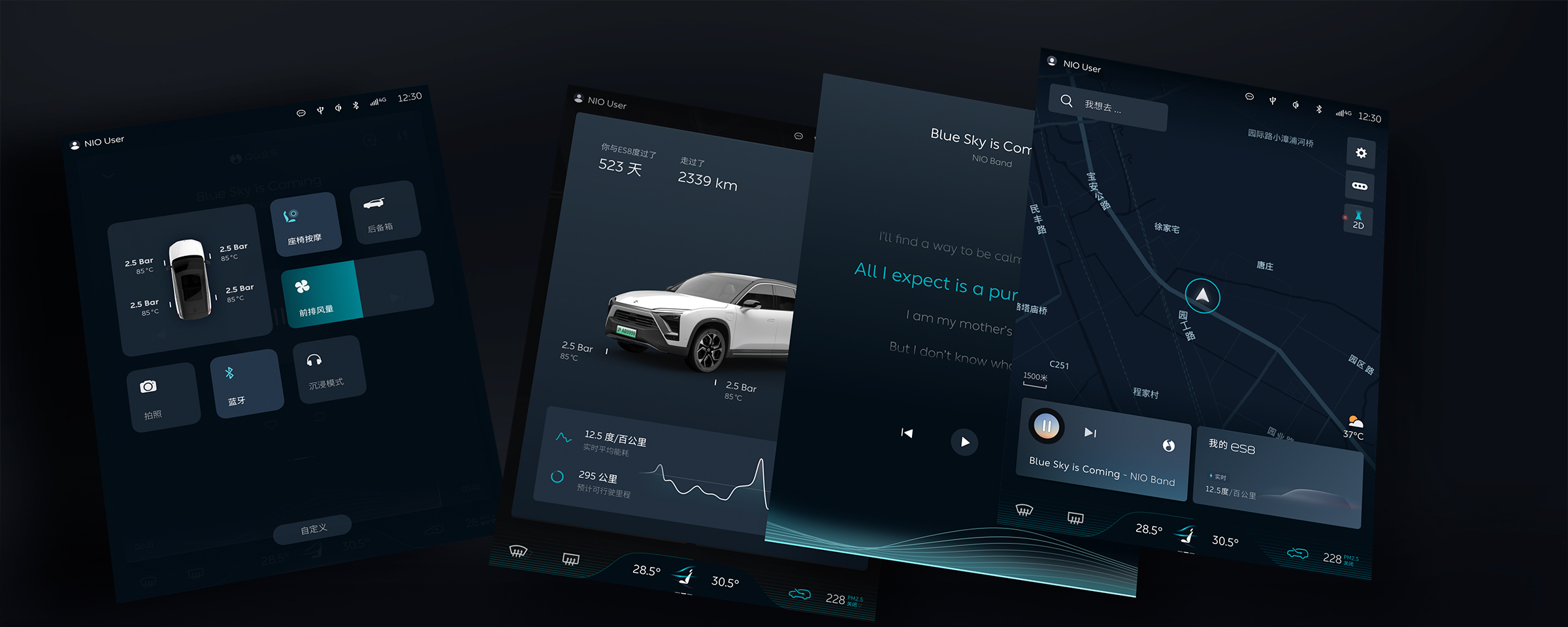
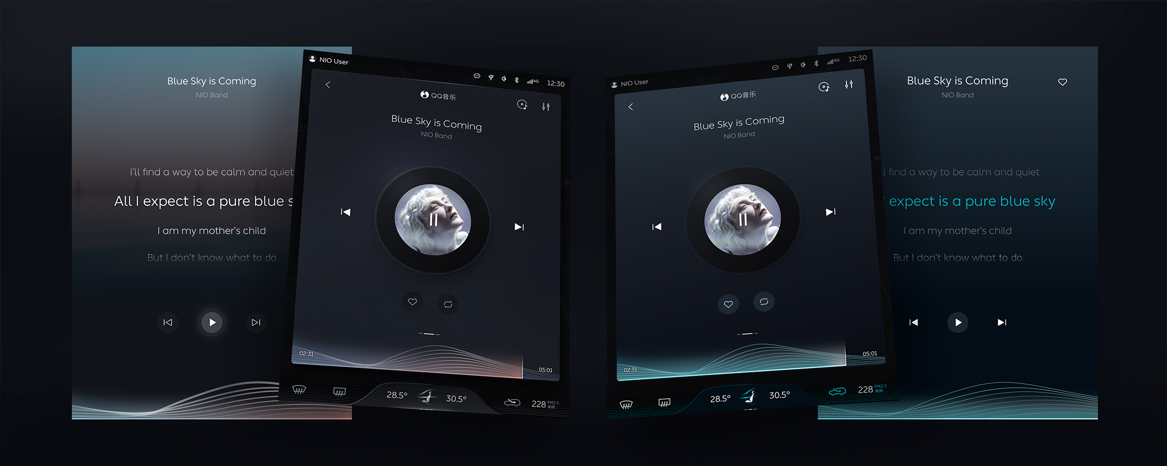
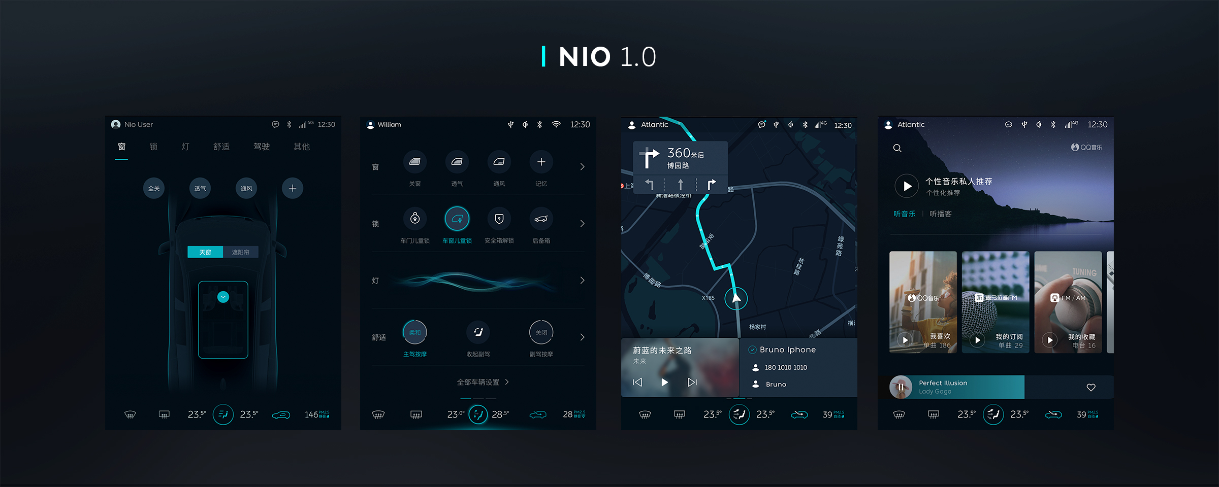
The prototypes started to emerge slowly and user feedback was crucial in various conditions that the car was driving through. Testing the feedbacks in lab conditions or on the terrain gave valuable feedback when updating the color schemes, icon styles and functionalities of the apps. As we continued more to update the overall eco system with efficient interactions and colors
05 :::
Final Product
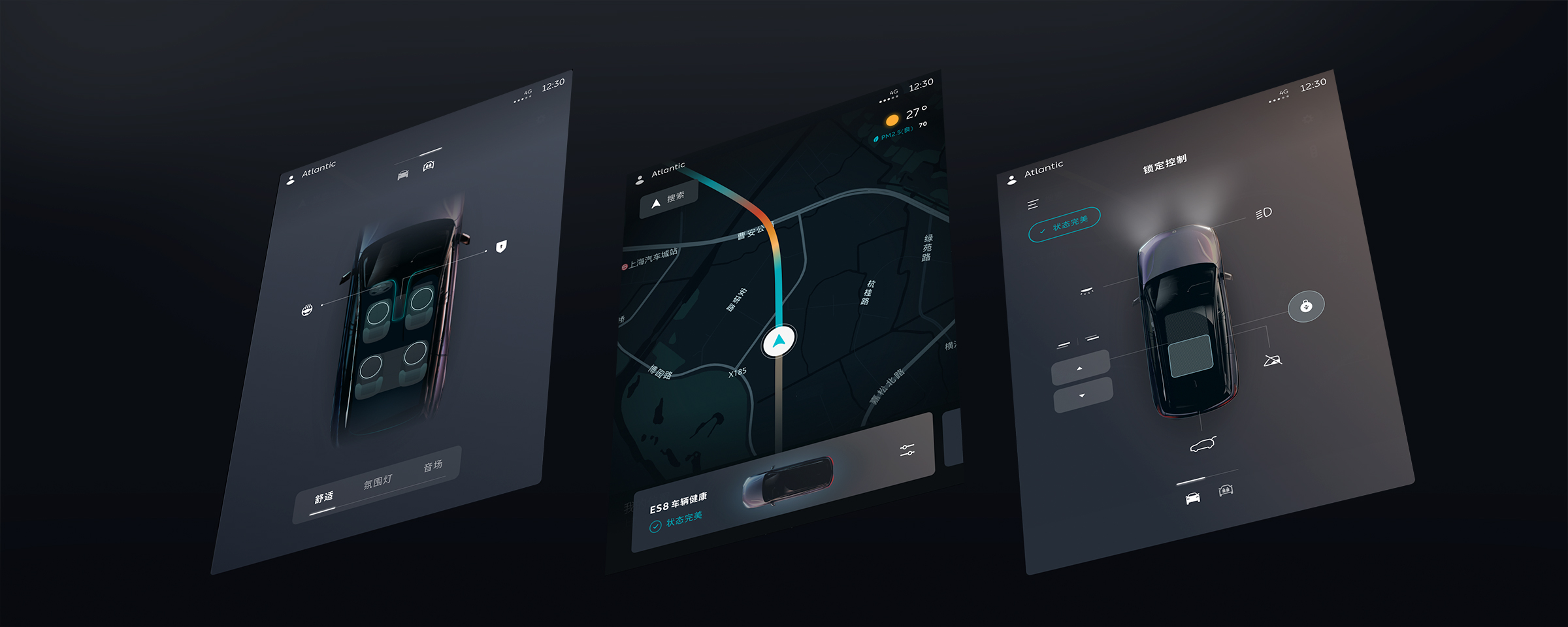
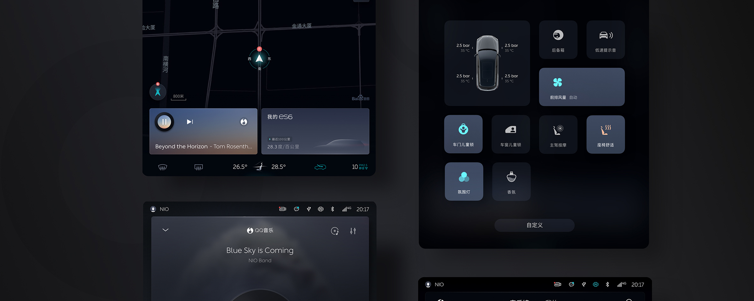
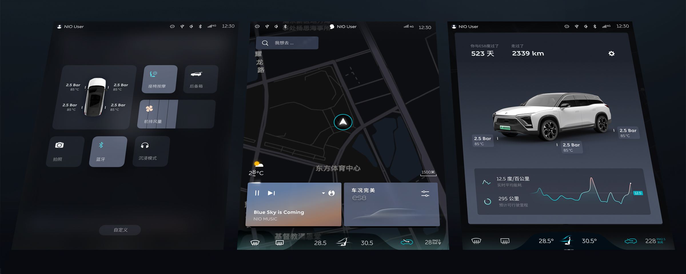
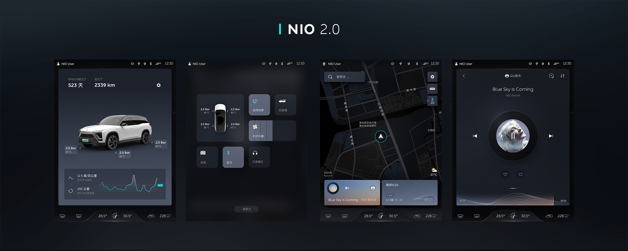
It took us several years of trial and error with a constant thought of "we can always do better" until we reached the NIO 2.0 version. The efforts paid off!
" Remember a space walk a day, keeps the doctor away.
Hit me up with your space thoughts! "
Unknown


